I’ve struggled with the UI in BattleGrid several times – I can never find something that feels right for the style of the game. Most of the time I just use simple gradient backgrounds because they’re easy and look decent. I was doing some thinking lately, and I came up with an idea for the in-game UI that I think I like.
Here’s the UI that’s been around for a while:

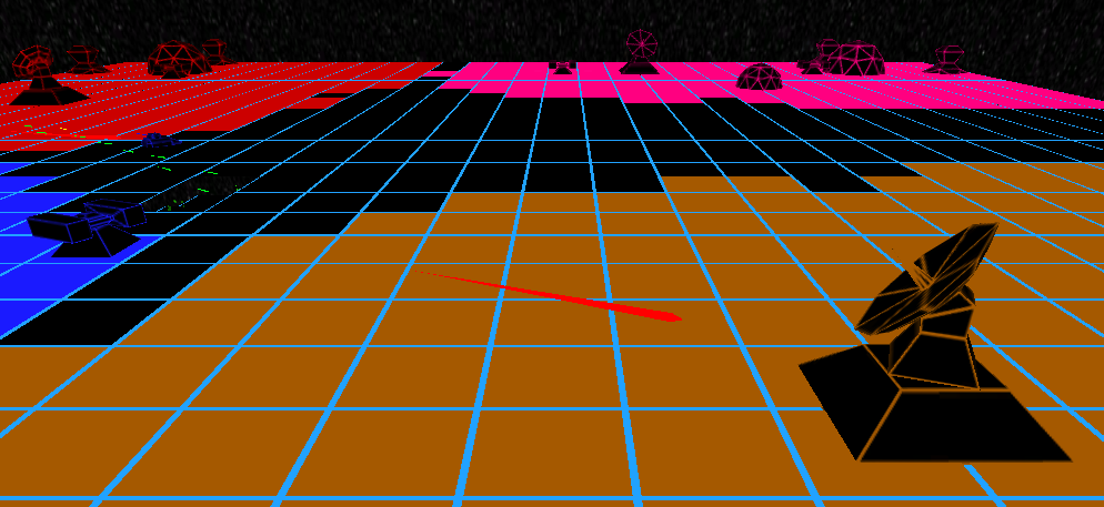
It works, but it takes up more room than I like, there’s an odd gap on the left, and it’s very bland. There’s a lot going on that doesn’t serve much purpose most of the time.
And here’s the new version I’ve been working on:

A lot of the space that was wasted on UI is gone. Instead, we have a simple pause button which now acts as a pause + config button (the game is paused in the screenshot, so it’s a “play” button), and your cache in the bottom right. The rest of the screen is opened up to enjoy the action and designate priority targets.
The build UI is removed entirely, in favor of a tap-to-place build menu that appears when you tap on a cell in the grid (a few other games have done this, and I like the feel). When you tap (or click) on any cell, the camera will center over that cell and the build menu appears.

Those three buttons lead to other menus with the actual structures in them, and when you click on the structure, it starts building on the selected cell. The same menu appears when selecting an existing structure, but the only button that pops up (for now) is the recycle button (to sell the structure).
There’s a bunch of new UI bugs now (there always are when making a big change like this), and I still need to re-code a few things to make the new build menu work well, but I already like the new UI better. I still want to do away with those gradient backgrounds, though…